Tool Wiz on my phone has a text function that I hardly ever use. I assume people use it to create memes and write jokey things about their friends. There are several variations in font types and decorations, only a few of which I have explored. The top image is a mirror version of my All done phrase. Below are kaleidoscope versions. Since this is a short and simple phrase, with a lot of background left, it's pretty easy to include the whole thing along the spokes.
You can adjust the sides from two to 16 and can chose which part of the image forms the center. Here is where the surprises come in. As shapes reach the middle they compress and combine with the same shape on the neighboring spokes. So below, the "all" part has blended into a sun shape and the tale of the d has also disappeared, giving you a spoke of "one".
Here is just the All part, looking like ancient traditional Chinese roof eaves. Only the A reminds you that it is a word.
You can also take your chosen number of spokes and your chosen starting point, and move over the center. So the words chosen don't change, but more of them are visible on the points of the stars than would be if they had stayed centered. This one says Watch out for the future, but it was one of my first efforts and I made the type too small and the background too dark.
Healdsburg had some very emphatic No Trespassing signs. I cut the background out and had fun with the sign text, both full version and just the first word.
At this point its not very text-like:
O's often become hearts. It's good to leave some contrasting background in your beginning photo so the words stand out better.
I like the emphasis on privacy here:
While making the images you can change where the letters overlap and which ones show, so one sign can give a lot of interesting results.
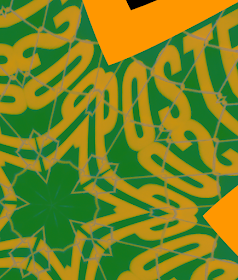
And here it is with the letters just looking like shapes in much of the image.
Another view of Posted where I changed the colors before starting the kaleidoscope.
Even if you aren't going for recognizable words, the crisp edges of the original letters make good designs.
Here the chain link fence became a more prominent part of the design.
Old Mill District machine (it looks like it's for funneling large amounts of grain into waiting train cars)
Because of the shadows on the tank, the resulting images are more subtle.
I love the doom predicted by this top sign. It sounds like something an exasperated tow truck owner has told foolish drivers over, and over, and over.....and they get towed out, for a price, of course. And keep your drugstore rafts for the kiddie pool. This is beside a low-lying area next to the Russian River, which becomes a powerful flooded force during the rainy season. They are not kidding for a reason.
Some quite spirited variations:
When you add layers of color behind you change the feel from warning sign to graphics exercise.
The center looks like it's written in some there language:
Another "we kid you not" warning sign. People must have tried some dumb stunts in the past in this area. This is at the entry to a dam, just below where the sand is piled up for many feet to prevent flooding.
Here the foolish dam walking person has turned into a poetic looking diver in the center:
Only 3 spokes, looks like universal caution symbol.
Something a bit less intense, my sketch of my car's dashboard with all the radio/cd control labels.
Here are all the numbers. Again the shading on the original makes the spokes look like they fold upwards and downwards.
This last one revealed a devilish little face, which I isolated. It makes me think, why not create a series of stamps with strange little faces like this. Pareidolia, by the way, is the scientific term for the human tendency to see faces in things. I had the same thing happen in one of my marbling projects. Would a primitive culture find a kind of magic in this ability to see faces? Are we examining them carefully to see if they represent some sort of threat to us? I've also read we do this with other human faces, a quick, perhaps lifesaving, determination of friend or foe based on expression.
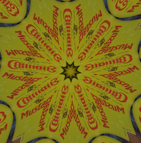
And last but not least, my prized giant Coleman's Mustard cans. I found them at the recycling center, restaurant sized cans with a dusting of mustard still inside. I absolutely love them. They do not need to be tarted or arted up in any way, they stand for greasy hotdogs on a hot beach.....
And make nice contrasty images.
OK, off to start the day. But rest assured I have a new side-thing whenever I go out taking photos....look for the text.....


No comments:
Post a Comment