While I didn't get a lot done for this class on vacation, I did have time to start a little box of goodies: 1 inch squares in green, buff yellow, brown, yellow-gray, red, medium gray and sky blue. I also made 2 inch squares in many of the same colors, plus a few other colors and white, figuring that this might provide some sort of baseline color effect. These colors were the best I could find out of several packets of craft cardboards. Something about geometry and color is very rewarding. I have some left over strips, long and medium, that I can use elsewhere.

In fact, I haven't glued anything down yet, I still want to play with color combinations more and figure they may come in handy for value studies. This is my medium gray over a bunch of different colors. The thing is, sometimes my eyes become too smart for their own good and I seem to see them all as the same value of gray, no matter what color is underneath. I'm assuming that is psychological and what I "know" is taking over what I can "see"? When I have that part of my brain a rest I can see that the gray squares over the greens certainly look lighter than the one over the white.
I only cropped these photos and didn't try to lighten them for fear my cell phone would decide to correct a color for some reason. It certainly has the capacity and I'm not sure if it would ask for my permission.

Here is red over other colors. I have to say, most of them look the same to me. I don't have the feeling of being able to pluck two of them off and setting them side by side and having them turn out to be different shades of red.

Greenish-gray. The square over the white looks darker than the others, the ones on the greens and the regular gray look lighter

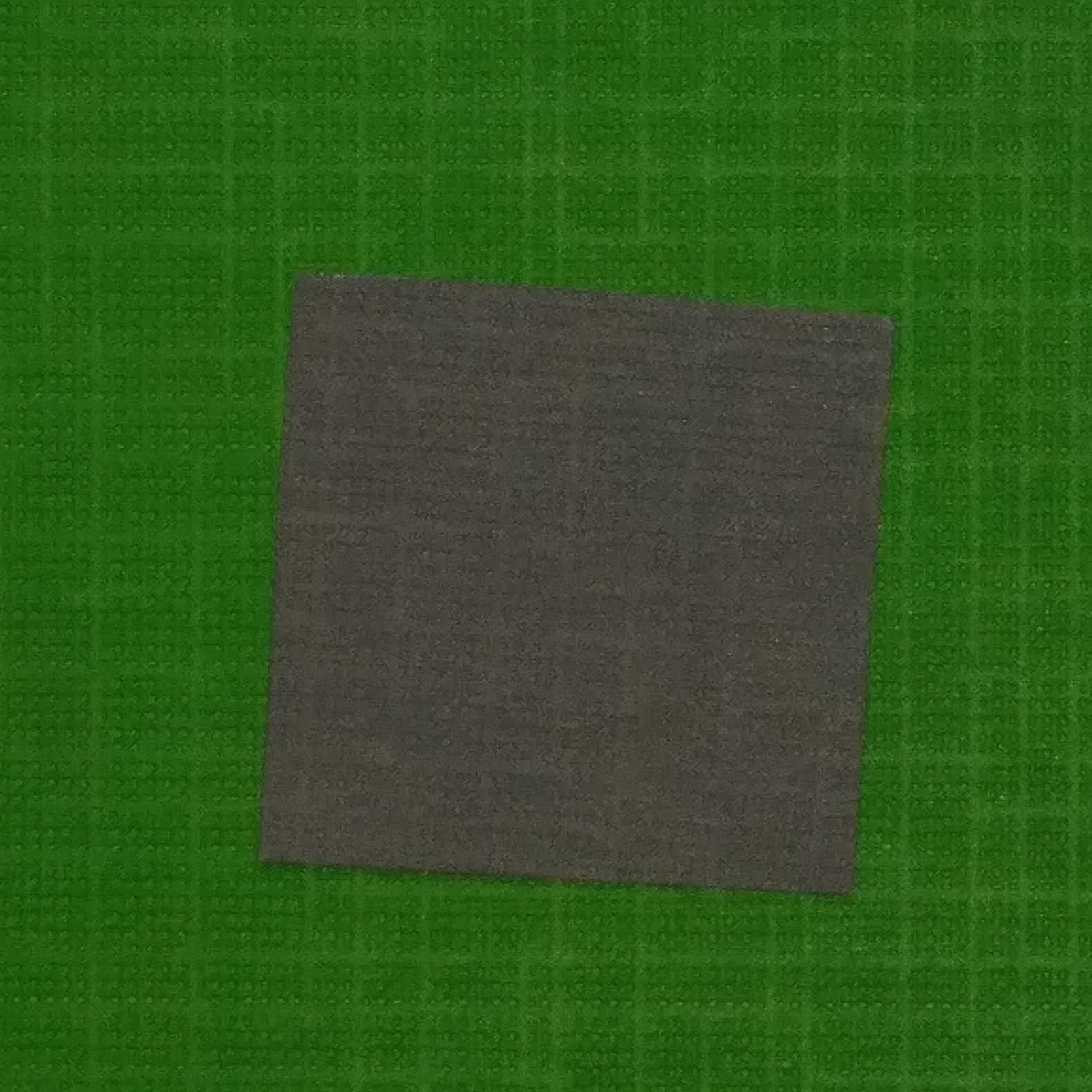
Brown squares. White looks darkest? The ones over the green-gray and regular gray look lightest? Notice my question marks?

Darkest on the white and red, lightest on itself.

Arghhhh, I can't tell. Darker on red than on dark blue? Lighter on the darker green.

Aaaand, the blue: Looks about the same everywhere to me. I really wonder if my camera made color corrections. Though when I looked at them with my bare eyes nothing stuck out all that much

I decided, just with the gray, to make separate images, so they wouldn't be affected by neighboring colors. Definitely dark on white:

And compared to above, it seems much, much lighter on the dark green.

So lets just repeat the white each time to have something fixed to compare.
Greenish gray is lighter than white.

The buff-yellow background seems to make the gray look darker than the others, though still lighter than the white.

All the rest are somewhat lighter, but not as dramatic as the greenish gray.


See, dark, light, in the middle.....
One thing I'm always aware of is the effect of light: intensity, direction, various source qualities of light, etc. I find myself almost never making design decisions in the late afternoon or evening because the quality of light is so poor in my bedroom. It's soothing, but poor. So many things don't seem bright enough or contrasty enough. Having learned in my photography class how many things can affect the colors that you see on your computer (from color calibration, which goes off and needs correction in computers quite often, to the range of colors available on a particular make of screen, or in a particular program, or when things are printed on a particular printer, and even the paper that is printed on), it seems like dealing with color relations is also dealing with a moving target. When I have had fabric commercially printed it often doesn't match the file I sent them (at least, as that file appears to me on my computer).
Later on I hope to pose some paper pieces with the long, thin scraps running between them to see what the colors do. Assuming my eyes will work.....
NOTE: This study is from an online design class I am taking with Lyric Kinard called The Artist's Toolbox, part 1. Information on the next offering of this class can be found here: https://app.ruzuku.com/courses/34574/about.
No comments:
Post a Comment