First I bought myself a lovely box of 120 crayons out of nostalgia. The box was a disappointment.....several tiny little boxes and a crayon sharpener inside, not the row upon row of solidly arranged crayons that I remember from September of my grade school days.
So I hunted for a range of blue crayons. Already I ran into difficulties because the blues are not just light to dark but are mixed with different colors: gray, green, red, etc.
I took a black and white photo to help me detect relative values, and learned that crayon cover paper can be deceptive. :-) I also learned that they have added a lot of silly neon colors and took away my favorite Mac and Cheese orange. Anyway, as seen above, the colors differed a lot and the results were waxy and full of color gaps that refused to fill in. So the changing appearance of the center squares is not very apparent.
The other thing I brought with me were packs of mixed origami papers, and that went better than crayons. I found a range of green and a range of blue and arranged them by value through black and white photos.
The greens:
The blues:
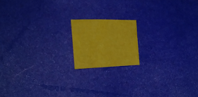
This went better. I cut mustard yellow and pink-brown squares to put in the middle. Though my eyes keep going back and forth between realizing all the inner squares are the same color and believing that the top one is the darkest and the bottom one the lightest.
I have a harder time seeing this with the blue.
Here is the darkest and the lightest blue with a yellow inner square. Top one is definitely lighter.
Same with the pinkish brown center.
And the top yellow center:
And the top pink brown center. But when I look at this last one too long they look the same. Is this the same for other people?
I'm thinking about how I might use this knowledge in future projects. Since my eyes are constantly playing tricks on me, I wonder if I will see the difference between reality and relationship in all cases. It would be interesting where there is a progression of shapes that grow larger or smaller in an art piece to mix the illusion of distance (further being smaller and darker) with the illusion of changing color in the centers of these shapes, as they would defy expectations by looking lighter when paired with the darker outer shapes.
NOTE: This study is from an online design class I am taking with Lyric Kinard called The Artist's Toolbox, part 1. Information on the next offering of this class can be found here: https://app.ruzuku.com/courses/34574/about.


No comments:
Post a Comment