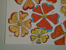
I went crazy with these flower shapes in one of my most recent Zentangles. I wasn't 100% happy with the piece (will show soon) but had a lot of fun with the Blooming Butter variation flowers. After filling in these flowers with various color sources, I got to wondering what products are best to use when filling in large amounts of space in Zentangles and sketches. So I drew 10 of these flowers and started to play.
This was the end result. The numbers are matched to comments below. I learned a lot and, unfortunately, am so in love with certain coloring products that I feel strongly tempted to go out and increase my range of colors. I looked for oranges and yellows for most of my samples, except for Posca pens, where I only have a few colors so far (those little devils are EXPENSIVE). Sorry the image is dark, my cell phone has been refusing to let me edit in ToolWiz because it doesn't yet realize I have deleted all those images....
1. Colored with red Prismacolor pencil and orange Blick colored pencil. Both have a decent color intensity (a few of these same brands are more waxy), but the coverage is rather uneven and gritty. On the plus side, pencils don't smudge or cover up the black ink very much, are fairly easy to be precise with if well sharpened and come in a lot of colors.
2. Derwent watercolor and Inktense pencils. This one looked identical to #1 until I added water. I just happened to use the same colors. Once wet, the colors run together in a nice translucent watercolor style. It doesn't cover up the black details much. The water took longer to dry than other watercolors, so I had to be careful not to let it run off the flower. Note that the color of the wood, the color of the pencil and the color when wet or dry do not match. So it's a bit of a mystery what you will get, and you should use a bit of scratch paper to experiment if you don't like surprises.
3. Colored Microline pens that came with the black ones. The colors are a bit harsh and there is no real choice in colors. When you run over the same area several times the color builds up upon itself so that the black lines become obscured except for the yellow and orange. The yellow also picks up the black ink to some degree, the orange less so. The resulting colors are vibrant, but I like them best for coloring small areas and making line art. When I used the yellow Microline in my recent Zentangle project and then painted and colored over it, it made a kind of resist effect that I liked.
4. Posca pen. Wow! It's actually acrylic paint, delivered in pen form. These are sharp tipped pens but still hard to get detail. The paint goes on absolutely opaque, so I had to run it next to the black lines. It dries pretty fast and I didn't try to blend it, so not sure if it's possible. It gives a very smooth, saturated effect. I wonder if there are any with even finer tips? It stands out the most among my sample flowers due to it's solid saturation.
5. Tombow pen. Bright, saturated colors that will bleed where they cover the black. The coverage is fairly smooth. Again I have limited colors and didn't try to blend.
6. Sharpies. Cheap, Target pens. They might be OK for thin lines and very small areas, but here they have a scratchy, uneven, blotchy appearance. They also make the black lines run when they cross them.
7. Pastel pencil. It's fun to apply, it feels gritty. What results is rather rough and blotchy, and it will rub off and on your work easily. I used a make up smudge to smooth it a bit but it still wants to travel and becomes lighter once you do this. The colors are nice.
8. Japanese watercolors, Kuretake manufacturer, Gansai Tambi. It's bright and blends like regular watercolors, though it's a bit more opaque. At first it seemed to cover up the black lines, but they reappeared once it dried.
9. Neocolor 2 crayones. I think I need more of these. It looked rough and scratchy until water added. It was more opaque and less blendy than the Derwent water color, #2, but that may have been because my colors were closer together. It covers the black lines a bit, but doesn't interact with them and cause running or smudging. The colors are nice and intense.
10. Prang water colors. They were less intense than more highly pigmented watercolors, but they also looked a bit dark because I was using colors blended with earlier, darker colors. It dried quite fast, perhaps because I was using a dryish brush. There are endless colors to be blended.
I love the effects of the various watercolors, and even the brush on ones were fairly easy to control using a small, decent quality brush. Except for the fine line pens, #3, none of these has enough control for really small areas, unless you are ok with an approximate coloring effect. Well, the Sharpies had enough control, but poor quality coverage. The other thing I did was to cover a piece of card paper completely with watercolors and then draw with the Fineline pens on top of it. It gives a very different effect, where the pen lines no longer dominate the piece.
Here I will end with some random sideways closeups:
Anyway, I've learned a lot, but it makes me want to increase my collections of inks, paints, pencils.....


No comments:
Post a Comment